Flutter Layout Basics - Row Horizontal Layout#
In Flutter, horizontal layout is achieved using Row, which arranges elements in a horizontal direction. If you want the child elements to fill the available space, you can wrap them with Expanded.
Background#
Widgets using Row layout cannot be scrolled; typically, when using Row layout, the combined width of all child elements should not exceed the width of the parent view. If horizontal scrolling is desired, consider using ListView.
Ps: A warning will appear when the combined width of all child elements exceeds the width of the parent view Row.
If you want a vertical layout, use Column.
If there is only one element, consider using Align or Center for layout.
Basic Introduction#
- Common properties of Row
- children: Child views
- textDirection: Layout direction of child views
- TextDirection.ltr: Left to right
- TextDirection.rtl: Right to left
- mainAxisAlignment: Layout method of child views in the parent view, horizontal layout
- MainAxisAlignment.spaceAround: Space between child views and space between child views and parent view
- MainAxisAlignment.center: All child views are centered
- MainAxisAlignment.end: All child views are at the end
- MainAxisAlignment.spaceBetween: Equal spacing between child views, no spacing with parent view
- MainAxisAlignment.spaceEvenly: Equal spacing between child views and spacing between child views and parent view
- MainAxisAlignment.start: All child views are at the start
Note that mainAxisAlignment has no effect when child elements are wrapped with Expanded; it also has no effect when all child elements exceed the width of the parent view.
If child elements are not wrapped with Expanded, their width will adapt to the content, meaning the width will be as much as the content requires. An example is shown below:
class MyApp extends StatelessWidget {
  @override
  Widget build(BuildContext context) {
    return MaterialApp(
      home: Scaffold(
          body: Center(
        child: Row(
          children: [
            Text(
              'First',
              style: TextStyle(backgroundColor: Colors.lightBlueAccent),
              textAlign: TextAlign.center,
            ),
            Text('Second',
                style: TextStyle(backgroundColor: Colors.lightGreenAccent),
                textAlign: TextAlign.center),
            Text('Third',
                style: TextStyle(backgroundColor: Colors.orangeAccent),
                textAlign: TextAlign.center),
          ],
        ),
      )),
    );
  }
}
The effect is as follows:
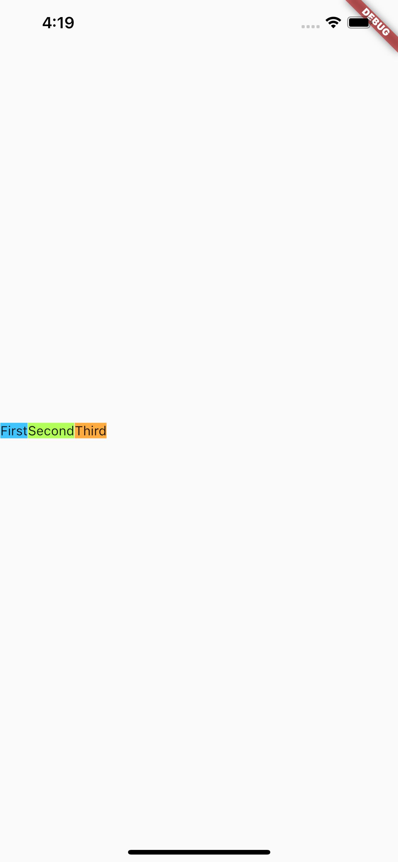
Note that the Text above has set textAlign, but regardless of the setting, the effect is the same.
If you want the above first, second, and third to fill the screen width, how should you set it? It's simple, just wrap them with Expanded. An example is shown below:
class MyApp extends StatelessWidget {
  @override
  Widget build(BuildContext context) {
    return MaterialApp(
      home: Scaffold(
          body: Center(
        child: Row(
          children: [
            Expanded(
                child: Text('First left',
                    style: TextStyle(backgroundColor: Colors.lightBlueAccent),
                    textAlign: TextAlign.left)),
            Expanded(
                child: Text('Second center',
                    style: TextStyle(backgroundColor: Colors.lightGreenAccent),
                    textAlign: TextAlign.center)),
            Expanded(
                child: Text('Third right',
                    style: TextStyle(backgroundColor: Colors.orangeAccent),
                    textAlign: TextAlign.right)),
          ],
        ),
      )),
    );
  }
}
The effect is as follows:
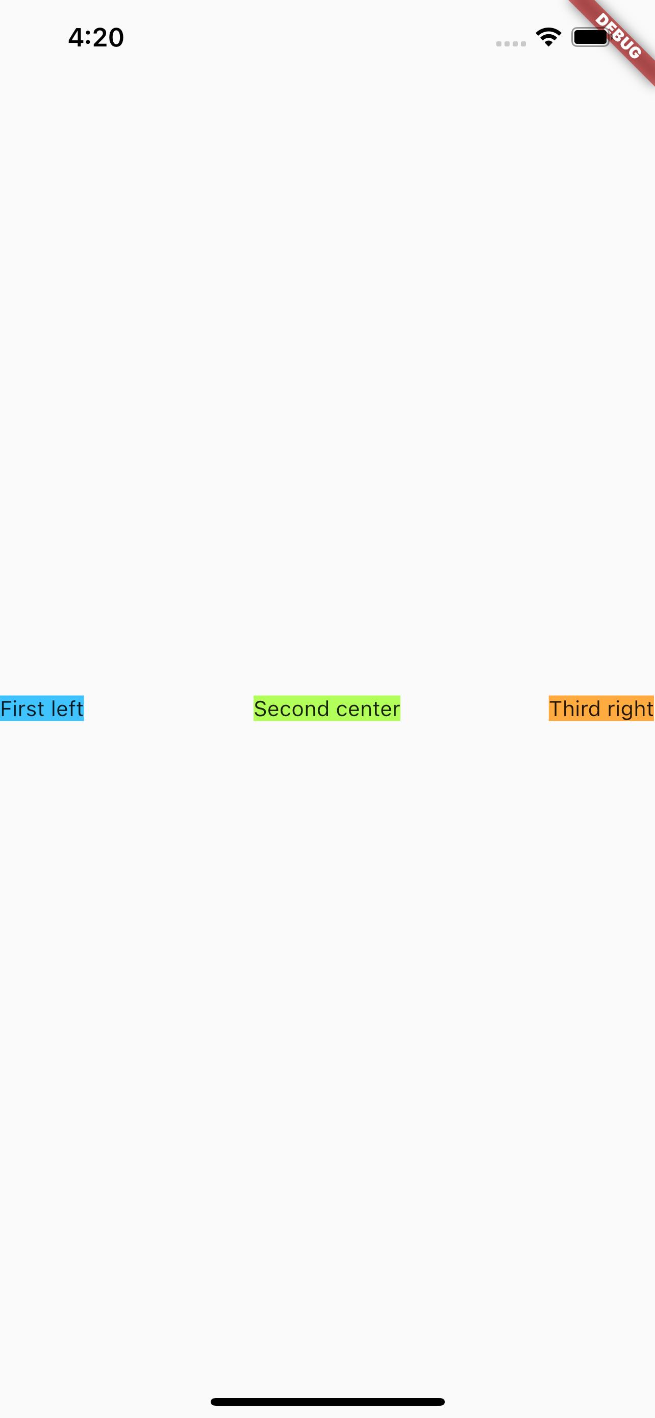
Similarly, the Text above has set textAlign, and setting different textAlign will show different effects. After comparison, it can be seen that when wrapped with Expanded, the three child elements equally share the screen width.
Practical Application#
Let's look at an effect where there is a small icon on the left, a long text in the middle, and another small icon on the right.
Now let's compare the display effects of the following situations:
- None of the child elements use
Expanded - All child elements use
Expanded - The long text in the middle uses
Expanded, while the other child elements do not
None of the child elements use Expanded#
The code is as follows:
class MyApp extends StatelessWidget {
  @override
  Widget build(BuildContext context) {
    return MaterialApp(
        home: Scaffold(
      body: Center(
        child: Row(children: [
          const FlutterLogo(),
          const Text(
              "Flutter's hot reload helps you quickly and easily experiment, build UIs, add features, and fix bug faster. Experience sub-second reload times, without losing state, on emulators, simulators, and hardware for iOS and Android."),
          const Icon(Icons.sentiment_satisfied),
        ]),
      ),
    ));
  }
}
The effect is as follows:
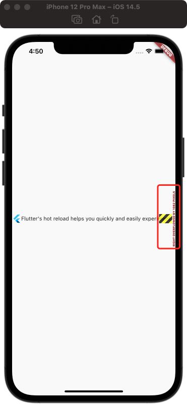
As can be seen, the left icon is displayed in its original size; the middle text is displayed but not fully; the right icon is not visible.
Remember the initial statement that when the width of child elements exceeds, Flutter will display a prompt. The part marked in red in the image is Flutter's prompt.
All child elements use Expanded#
The code is as follows:
class MyApp extends StatelessWidget {
  @override
  Widget build(BuildContext context) {
    return MaterialApp(
        home: Scaffold(
      body: Center(
        child: Row(children: [
          Expanded(child: FlutterLogo()),
          Expanded(
              child: const Text(
                  "Flutter's hot reload helps you quickly and easily experiment, build UIs, add features, and fix bug faster. Experience sub-second reload times, without losing state, on emulators, simulators, and hardware for iOS and Android.")),
          Expanded(child: const Icon(Icons.sentiment_satisfied)),
        ]),
      ),
    ));
  }
}
The effect is as follows:
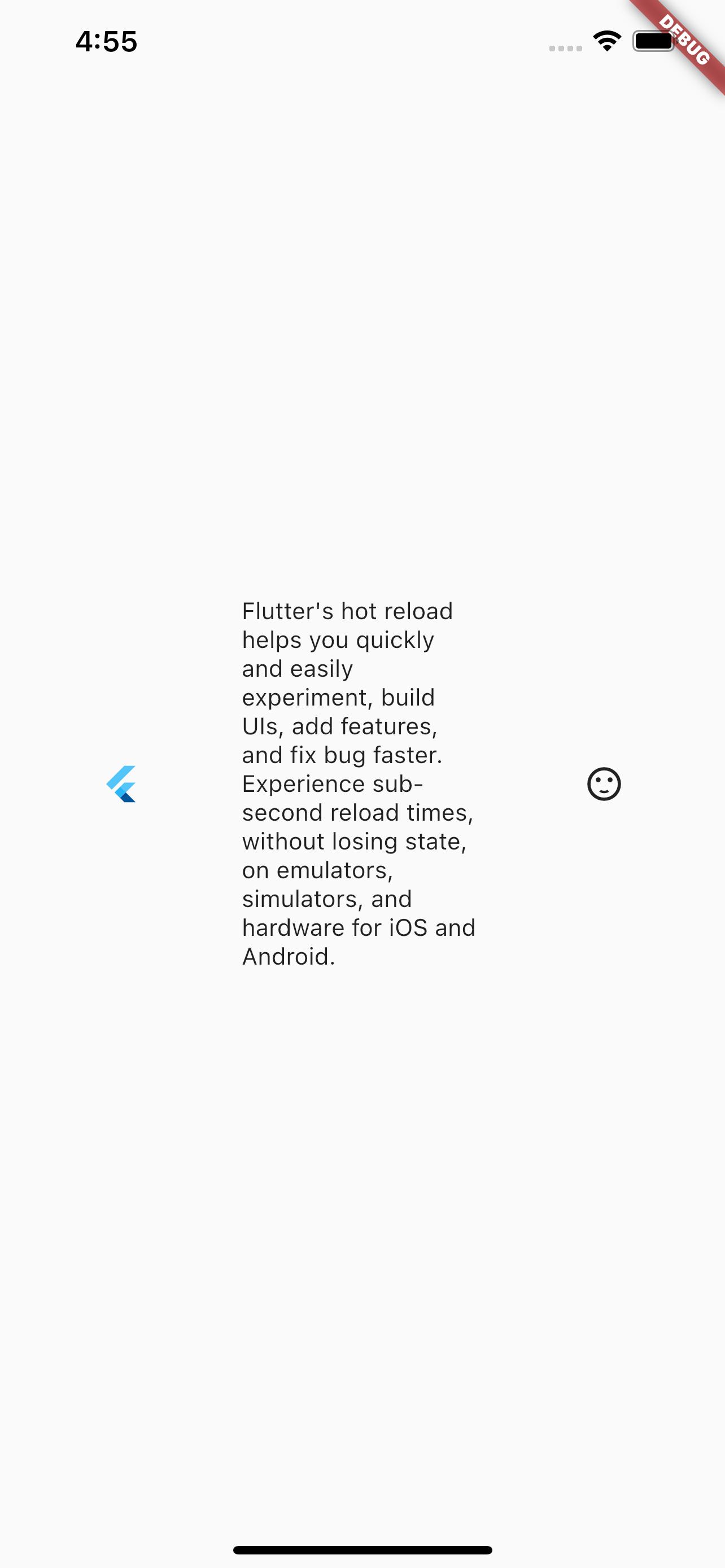
As can be seen, all child elements are displayed, and all child elements equally share the width of the parent element, as can be seen from the display of the middle text. This confirms the earlier statement that when all child elements are wrapped with Expanded, the width is evenly distributed.
The long text in the middle uses Expanded, while the other child elements do not#
The code is as follows:
class MyApp extends StatelessWidget {
  @override
  Widget build(BuildContext context) {
    return MaterialApp(
        home: Scaffold(
      body: Center(
        child: Row(children: [
          const FlutterLogo(),
          Expanded(
              child: const Text(
                  "Flutter's hot reload helps you quickly and easily experiment, build UIs, add features, and fix bug faster. Experience sub-second reload times, without losing state, on emulators, simulators, and hardware for iOS and Android.")),
          const Icon(Icons.sentiment_satisfied),
        ]),
      ),
    ));
  }
}
The effect is as follows:
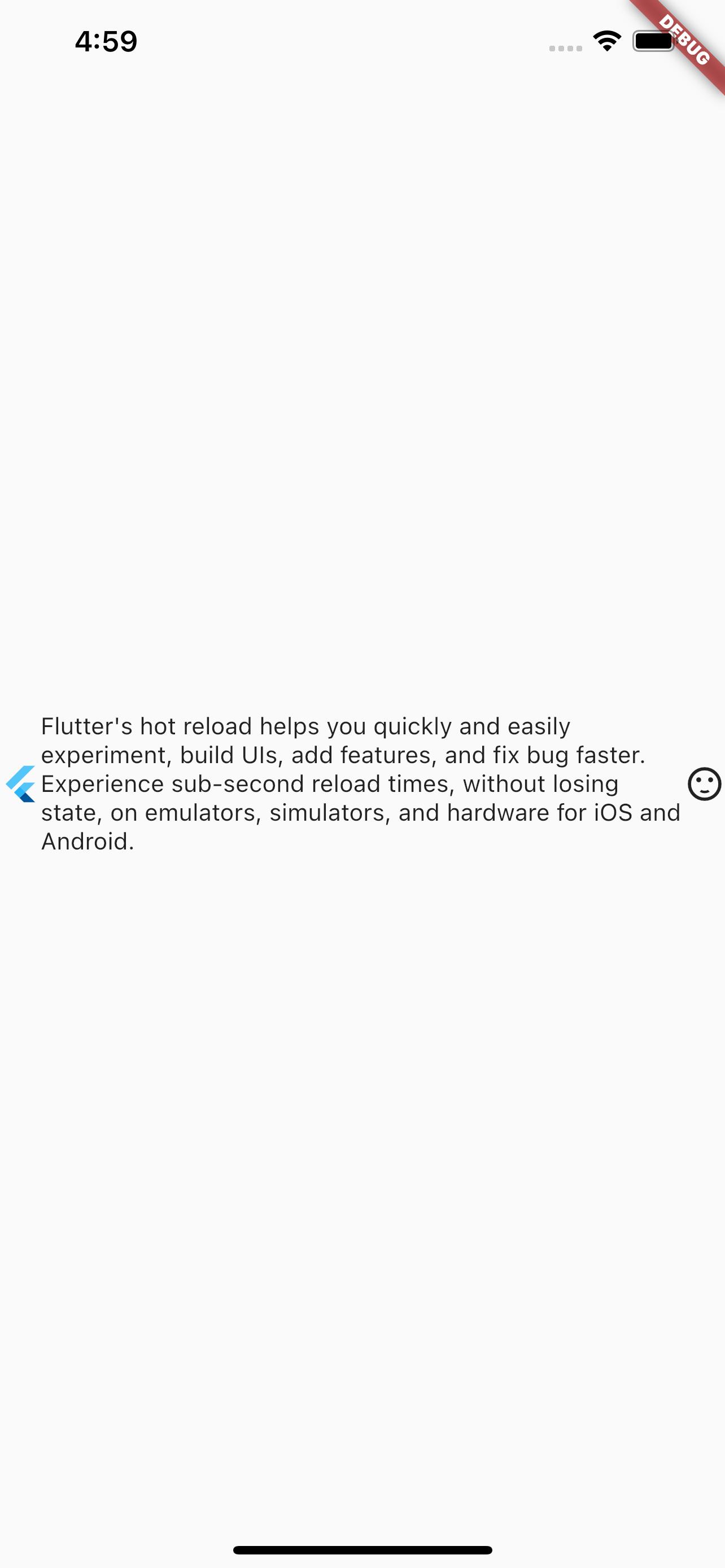
It can be seen that all child elements are displayed, and the left and right icons are shown at their original sizes, while the remaining space is used to display the text without exceeding the limits.