Flutter Layout Basics - Column Vertical Layout#
Column is a Widget for laying out child views in a vertical direction, similar to Row. If you want the child views to fill the available space, you can use Expanded to include the child views.
Column cannot scroll (generally, when using Column, the content of the child views should not exceed the height of the parent view). If there are many child views that require scrolling, it is recommended to use ListView.
If you want a horizontal layout, use Row.
If there is only one element, consider using Align or Center for layout.
Basic Usage#
Common properties of Column are as follows:
- Common properties of Column
- children: Child views
- textDirection: Horizontal layout direction of child views
- TextDirection.ltr: Left to right
- TextDirection.rtl: Right to left
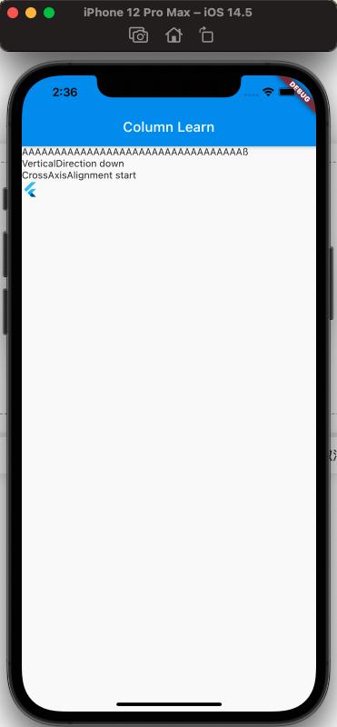
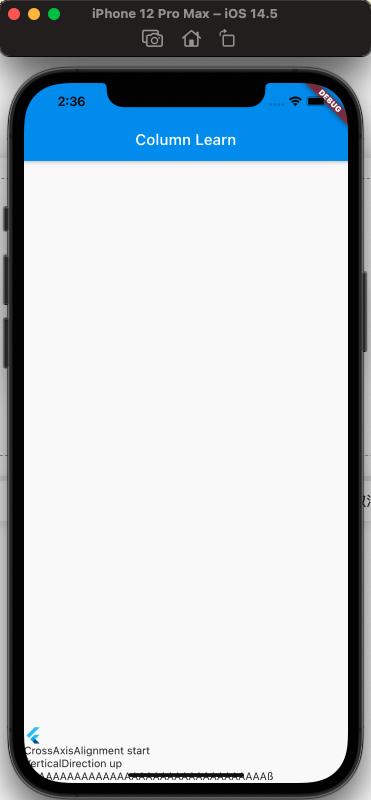
- verticalDirection: Vertical layout direction of child views
- VerticalDirection.down: From top to bottom, this is the default
- VerticalDirection.up: From bottom to top
- mainAxisSize: Size occupied by child views in the vertical direction of the parent view
- MainAxisSize.min: Minimum, after setting this, if you set mainAxisAlignment, the display effect is consistently start
- MainAxisSize.max: Maximum, this is the default, according to the size of the parent view
- mainAxisAlignment: Layout method of child views on the parent view, vertical layout
- MainAxisAlignment.spaceAround: There is space between child views and between child views and the parent view
- MainAxisAlignment.center: All child views are centered
- MainAxisAlignment.end: All child views are at the end
- MainAxisAlignment.spaceBetween: Equal space between child views, no space with the parent view
- MainAxisAlignment.spaceEvenly: There is space between child views and between child views and the parent view, and the spacing is equal
- MainAxisAlignment.start: All child views are at the start
- crossAxisAlignment: Horizontal layout method of child views
- CrossAxisAlignment.start: Left-aligned layout
- CrossAxisAlignment.end: Right-aligned layout
- CrossAxisAlignment.center: Center-aligned layout, this is the default
- CrossAxisAlignment.stretch
- CrossAxisAlignment.baseline
Let's look at them one by one:
Effect of textDirection:#
The code is as follows:
class MyApp extends StatelessWidget {
  @override
  Widget build(BuildContext context) {
    return MaterialApp(
      home: Scaffold(
        appBar: new AppBar(
          title: new Text('Column Learn'),
        ),
        body: Column(
          textDirection: TextDirection.ltr,
          crossAxisAlignment: CrossAxisAlignment.start,
          children: [
            Text('AAAAAAAAAAAAAAAAAAAAAAAAAAAAAAAAAAß'),
            Text('TextDirection rtl'),
            Text('CrossAxisAlignment start'),
            FlutterLogo()
          ],
        ),
      ),
    );
  }
}
The effect is as follows:
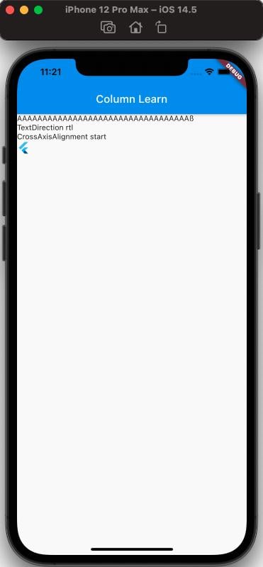
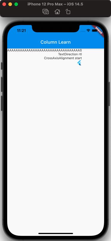
From the effect, it can be seen that textDirection is the direction of horizontal layout of child views, but it should be noted that crossAxisAlignment is also set here. Because if not set, the display effect is consistent with CrossAxisAlignment.center, and simply setting textDirection has no effect. Those interested can verify this themselves.
Ps: It should be noted that the effect of CrossAxisAlignment.center is not as imagined, where the entire screen width is centered. In fact, it is centered according to the width of the longest child view.
Effect of verticalDirection#
The code is as follows:
class MyApp extends StatelessWidget {
  @override
  Widget build(BuildContext context) {
    return MaterialApp(
      home: Scaffold(
        appBar: new AppBar(
          title: new Text('Column Learn'),
        ),
        body: Column(
          verticalDirection: VerticalDirection.down,
          crossAxisAlignment: CrossAxisAlignment.start,
          children: [
            Text('AAAAAAAAAAAAAAAAAAAAAAAAAAAAAAAAAAß'),
            Text('VerticalDirection up'),
            Text('CrossAxisAlignment start'),
            FlutterLogo()
          ],
        ),
      ),
    );
  }
}
The effect is as follows:
Effects of mainAxisSize & mainAxisAlignment#
Effect of mainAxisSize:
The code is as follows:
class MyApp extends StatelessWidget {
  @override
  Widget build(BuildContext context) {
    return MaterialApp(
      home: Scaffold(
        appBar: new AppBar(
          title: new Text('Column Learn'),
        ),
        body: Column(
          mainAxisAlignment: MainAxisAlignment.spaceAround,
          mainAxisSize: MainAxisSize.max,
          crossAxisAlignment: CrossAxisAlignment.start,
          children: [
            Text('AAAAAAAAAAAAAAAAAAAAAAAAAAAAAAAAAAß'),
            Text('MainAxisAlignment spaceAround'),
            Text('MainAxisSize max'),
            Text('CrossAxisAlignment start'),
            FlutterLogo()
          ],
        ),
      ),
    );
  }
}
The effect is as follows:
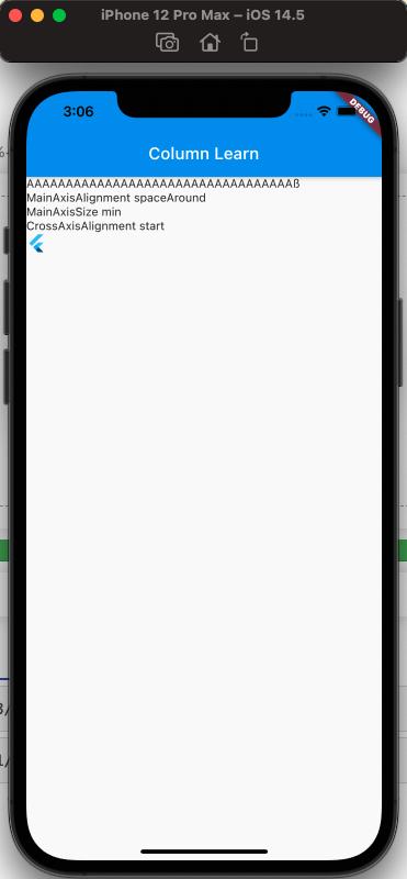
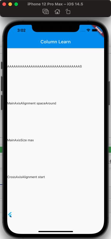
It can be seen that when mainAxisAlignment is set to spaceAround, the difference between setting mainAxisSize to min and max is that setting max adapts to the full screen, while setting min has no effect.
Effect of mainAxisAlignment (when mainAxisSize is max):
The code is as follows:
class MyApp extends StatelessWidget {
  @override
  Widget build(BuildContext context) {
    return MaterialApp(
      home: Scaffold(
        appBar: new AppBar(
          title: new Text('Column Learn'),
        ),
        body: Column(
          mainAxisAlignment: MainAxisAlignment.spaceEvenly,
          mainAxisSize: MainAxisSize.max,
          crossAxisAlignment: CrossAxisAlignment.start,
          children: [
            Text('AAAAAAAAAAAAAAAAAAAAAAAAAAAAAAAAAAß'),
            Text('MainAxisAlignment spaceEvenly'),
            Text('MainAxisSize max'),
            Text('CrossAxisAlignment start'),
            FlutterLogo()
          ],
        ),
      ),
    );
  }
}
The effect is as follows:
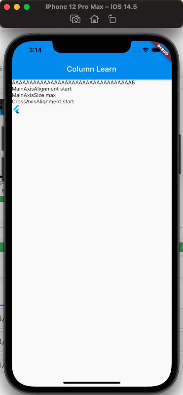
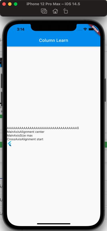
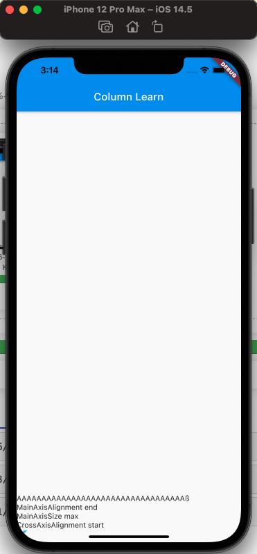
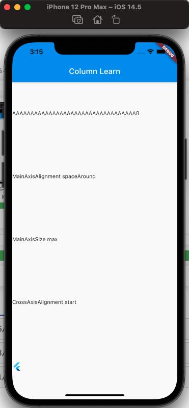
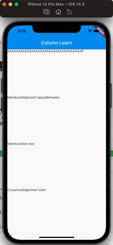
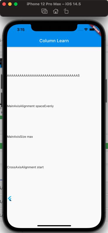
From the images, it can be seen that when mainAxisSize is max, the display effects of different values of mainAxisAlignment vary.
Effect of crossAxisAlignment#
The code is as follows:
class MyApp extends StatelessWidget {
  @override
  Widget build(BuildContext context) {
    return MaterialApp(
      home: Scaffold(
        appBar: new AppBar(
          title: new Text('Column Learn'),
        ),
        body: Column(
          mainAxisSize: MainAxisSize.max,
          crossAxisAlignment: CrossAxisAlignment.start,
          children: [
            Text('AAAAAAAAAAAAAAAAAAAAAAAAAAAAAAAAAAß'),
            Text('MainAxisSize max'),
            Text('CrossAxisAlignment start'),
            FlutterLogo()
          ],
        ),
      ),
    );
  }
}
The display effect is as follows:
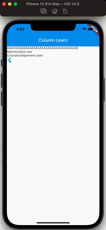
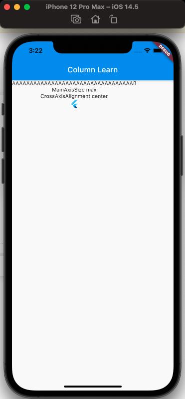
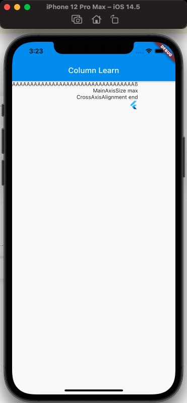
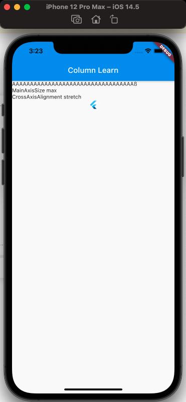
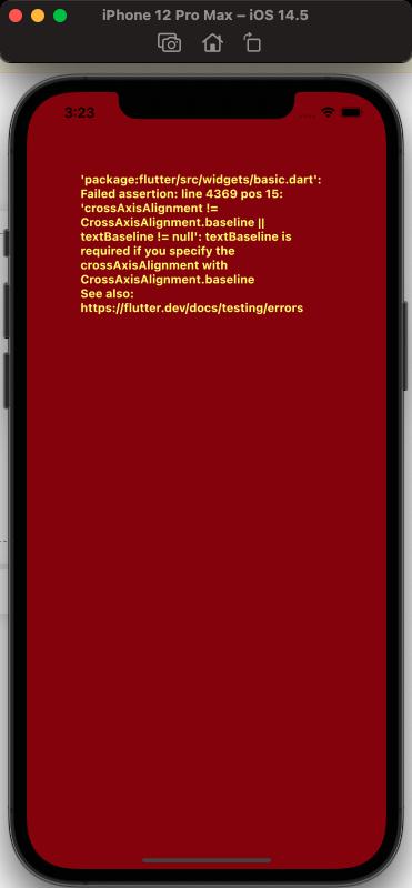
From the above, the display effects of different values of crossAxisAlignment can be seen.
However, when the value is baseline, an error occurs, and the error is
══╡ EXCEPTION CAUGHT BY WIDGETS LIBRARY ╞═══════════════════════════════════════════════════════════ The following assertion was thrown building MyApp(dirty): textBaseline is required if you specify the crossAxisAlignment with CrossAxisAlignment.baseline 'package:flutter/src/widgets/basic.dart': Failed assertion: line 4369 pos 15: 'crossAxisAlignment != CrossAxisAlignment.baseline || textBaseline != null'
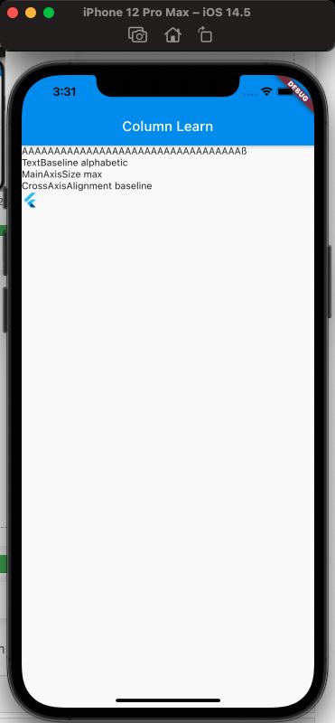
What is the reason? According to the error message, it can be inferred that when crossAxisAlignment.baseline is set, the textBaseline property needs to be set, so adding the textBaseline property can solve the problem.
The code is as follows:
class MyApp extends StatelessWidget {
  @override
  Widget build(BuildContext context) {
    return MaterialApp(
      home: Scaffold(
        appBar: new AppBar(
          title: new Text('Column Learn'),
        ),
        body: Column(
          textBaseline: TextBaseline.alphabetic,
          mainAxisSize: MainAxisSize.max,
          crossAxisAlignment: CrossAxisAlignment.baseline,
          children: [
            Text('AAAAAAAAAAAAAAAAAAAAAAAAAAAAAAAAAAß'),
            Text('TextBaseline alphabetic'),
            Text('MainAxisSize max'),
            Text('CrossAxisAlignment baseline'),
            FlutterLogo()
          ],
        ),
      ),
    );
  }
}
The effect is as follows:
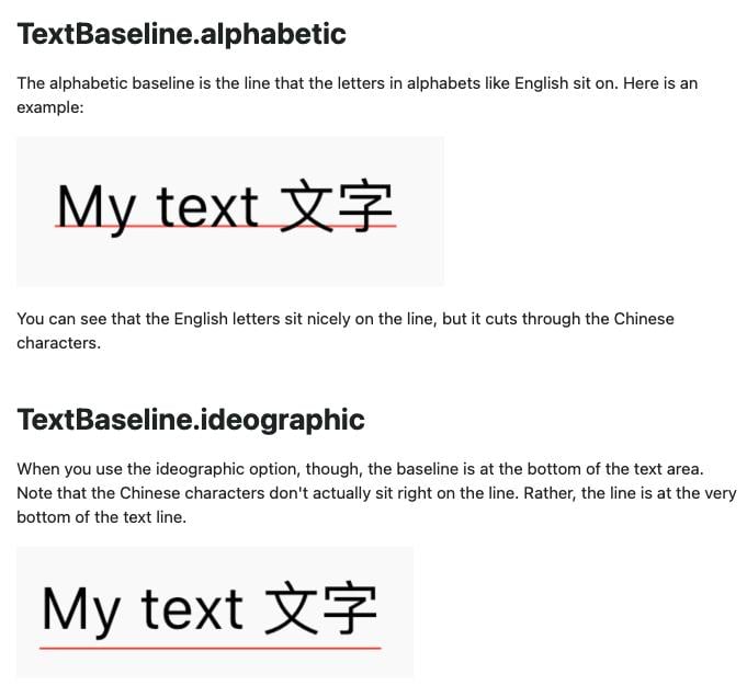
What are the differences in the different values of textBaseline? Refer to What is the difference between alphabetic and ideographic in Flutter's TextBaseline enum
The screenshot is as follows:
Official Tips to Note#
Important Note 1#
When there are Expanded or Flexible child views in the Column, and this Column Widget is placed inside another Column Widget or ListView or other widgets with an undefined height, an error will occur.
Verification code is as follows:
class MyApp extends StatelessWidget {
  @override
  Widget build(BuildContext context) {
    return MaterialApp(
      home: Scaffold(
        appBar: new AppBar(
          title: new Text('Column Learn'),
        ),
        body: Column(
          textBaseline: TextBaseline.ideographic,
          mainAxisSize: MainAxisSize.max,
          crossAxisAlignment: CrossAxisAlignment.baseline,
          children: [
            Column(
              children: [Expanded(child: FlutterLogo())],
            ),
          ],
        ),
      },
    );
  }
}
The error is as follows:
══╡ EXCEPTION CAUGHT BY RENDERING LIBRARY ╞═════════════════════════════════════════════════════════ The following assertion was thrown during performLayout(): RenderFlex children have non-zero flex but incoming height constraints are unbounded.
The reason for the error is:
When using Expanded, it requires the height of the parent view to be fixed, and the child view included by Expanded fills the area of the parent view. If a Column or ListView or other scrollable views are nested, the height of the parent view is not fixed, and thus Expanded cannot fill it.
Solution:
When the outer layer is a Column, you can use Expanded to include the inner Column, which effectively tells the inner Column Widget to fill the height of the outer Column, thus determining the height.
The code is as follows:
class MyApp extends StatelessWidget {
  @override
  Widget build(BuildContext context) {
    return MaterialApp(
      home: Scaffold(
        appBar: new AppBar(
          title: new Text('Column Learn'),
        ),
        body: Column(
          textBaseline: TextBaseline.ideographic,
          mainAxisSize: MainAxisSize.min,
          crossAxisAlignment: CrossAxisAlignment.baseline,
          children: [
            Expanded(
              child: Column(
                children: [Expanded(child: FlutterLogo())],
              ),
            ),
          ],
        ),
      },
    );
  }
}
When the outer layer is a ListView or other scrollable views, since the height of the content in the scrollable view cannot be determined, you need to consider why there are Expanded or Flexible child views in the Column Widget when the outer layer has a view with an undefined height. The usual solution is to remove the Expanded or Flexible from the inner child views.
Important Note 2#
Similar to Row, when the content of child views exceeds the area of the parent view, Flutter will display a yellow warning in Debug mode. The effect is as follows:
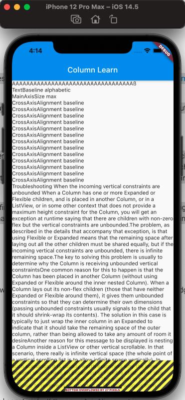
Solution:
Consider using ListView to replace Column, making the content of child views scrollable.