Flutter 布局基础 ——BottomNavigationBar#
背景#
Flutter中BottomNavigationBar类似于 iOS 中的UITabbarController,是导航控制器的一种,常用于首页 Tab 切换。
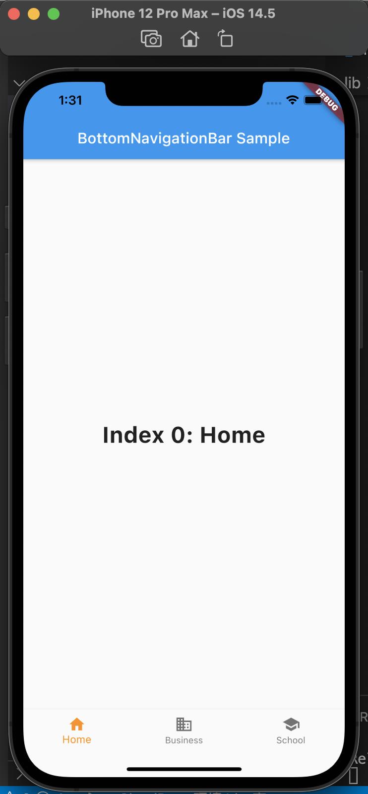
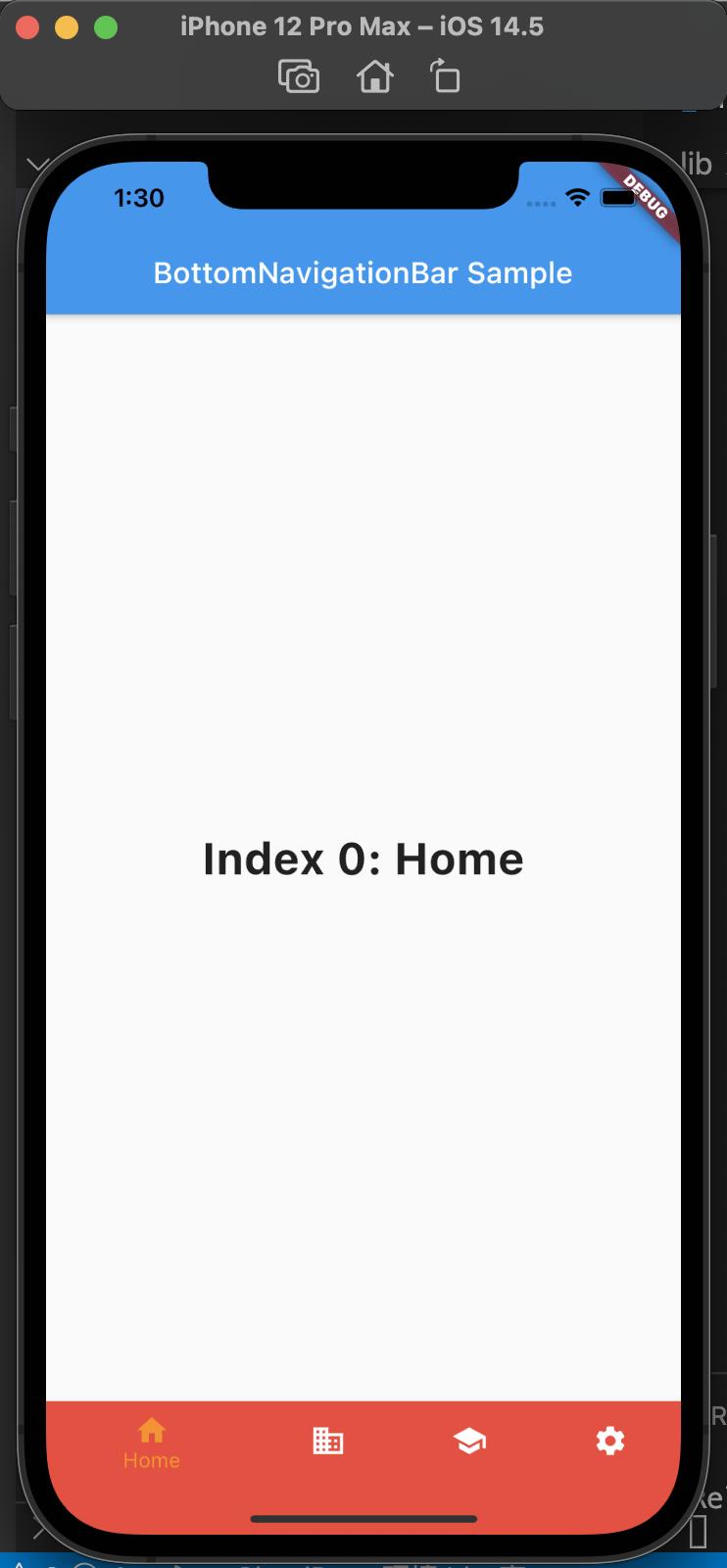
BottomNavigationBar的 type 属性,默认值会根据items的个数而定;当items个数小于 4 个时,默认值为BottomNavigationBarType.fixed;当items个数大于等于 4 个,默认值为BottomNavigationBarType.shifting。
两种效果对比如下:左侧为BottomNavigationBarType.fixed,右侧为BottomNavigationBarType.shifting
常用属性如下:
- backgroundColor: 背景色
- currentIndex: 当前选中哪一个
- fixedColor: 选中 Item 的颜色
- iconSize: 图片大小
- items: 子元素
- onTap: 点击事件
- selectedFontSize: 选中字体大小
- selectedItemColor: 选中 Icon 颜色
- selectedLabelStyle: 选中文字的 style
- type: icon 和文字的样式
- unselectedItemColor: 未选中 Icon 的颜色
- unselectedLabelStyle: 未选中文字样式
代码如下:
void main() => runApp(new MyApp());

class MyApp extends StatelessWidget {
  const MyApp({Key? key}) : super(key: key);

  static const String _title = 'Flutter Code Sample';

  @override
  Widget build(BuildContext context) {
    return const MaterialApp(
      title: _title,
      home: MyStatefulWidget(),
    );
  }
}

class MyStatefulWidget extends StatefulWidget {
  const MyStatefulWidget({Key? key}) : super(key: key);

  @override
  State<MyStatefulWidget> createState() => _MyStatefulWidgetState();
}

class _MyStatefulWidgetState extends State<MyStatefulWidget> {
  int _selectedIndex = 0;
  static const TextStyle optionStyle =
      TextStyle(fontSize: 30, fontWeight: FontWeight.bold);
  static const List<Widget> _widgetOptions = <Widget>[
    Text(
      'Index 0: Home',
      style: optionStyle,
    ),
    Text(
      'Index 1: Business',
      style: optionStyle,
    ),
    Text(
      'Index 2: School',
      style: optionStyle,
    )
  ];

  void _onItemTapped(int index) {
    setState(() {
      _selectedIndex = index;
    });
  }

  @override
  Widget build(BuildContext context) {
    return Scaffold(
      appBar: AppBar(
        title: const Text('BottomNavigationBar Sample'),
      ),
      body: Center(
        child: _widgetOptions.elementAt(_selectedIndex),
      ),
      bottomNavigationBar: BottomNavigationBar(
        items: const <BottomNavigationBarItem>[
          BottomNavigationBarItem(icon: Icon(Icons.home), label: 'Home'),
          BottomNavigationBarItem(
              icon: Icon(Icons.business), label: 'Business'),
          BottomNavigationBarItem(icon: Icon(Icons.school), label: 'School'),
        ],
        currentIndex: _selectedIndex,
        selectedItemColor: Colors.amber[800],
        onTap: _onItemTapped,
      ),
    );
  }
}
也可以如下使用,
main.dart 中,声明 home 为 BottomNavigationWidget
void main() => runApp(new MyApp());

class MyApp extends StatelessWidget {
  @override
  Widget build(BuildContext context) {
    return MaterialApp(
      title: 'Flutter bottomNavigationBar',
      theme: ThemeData.light(),
      home: BottomNavigationWidget(),
    );
  }
}
然后创建 bottom_navigation_widget.dart,内容如下:
import 'dart:ffi';

import 'package:flutter/material.dart';
import 'package:flutter_application_1/pages/airplay_screen.dart';
import 'package:flutter_application_1/pages/email_screen.dart';
import 'package:flutter_application_1/pages/home_screen.dart';
import 'package:flutter_application_1/pages/pages_screen.dart';

class BottomNavigationWidget extends StatefulWidget {
  _BottomNavigationWidgetState createState() => _BottomNavigationWidgetState();
}

class _BottomNavigationWidgetState extends State<BottomNavigationWidget> {
  final _BottomNavigationColor = Colors.blue;

  int _currentIndex = 0;
  List<Widget> list = [];

  @override
  void initState() {
    list
      ..add(HomeScreen())
      ..add(EmailScreen())
      ..add(PageScreen())
      ..add(AirplayScreen());

    super.initState();
  }

  @override
  Widget build(BuildContext context) {
    return Scaffold(
      body: list[_currentIndex],
      bottomNavigationBar: BottomNavigationBar(
        items: [
          BottomNavigationBarItem(
            icon: Icon(
              Icons.home,
              color: _BottomNavigationColor,
            ),
            label: 'Home',
          ),
          BottomNavigationBarItem(
            icon: Icon(
              Icons.email,
              color: _BottomNavigationColor,
            ),
            label: 'Email',
          ),
          BottomNavigationBarItem(
            icon: Icon(
              Icons.pages,
              color: _BottomNavigationColor,
            ),
            label: 'Pages',
          ),
          BottomNavigationBarItem(
            icon: Icon(
              Icons.airplay,
              color: _BottomNavigationColor,
            ),
            label: 'AirPlay',
          ),
        ],
        currentIndex: _currentIndex,
        // type: BottomNavigationBarType.fixed,
        onTap: (int index) {
          setState(() {
            _currentIndex = index;
          });
        },
      ),
    );
  }
}
然后创建 pages 目录,pages 目录中创建home_screen.dart、airplay_screen.dart、email_screen.dart、pages_screen.dart,
代码如下:
/// home_screen.dart
import 'package:flutter/material.dart';

class HomeScreen extends StatelessWidget {
  @override
  Widget build(BuildContext context) {
    return Scaffold(
      appBar: AppBar(
        title: Text('Home'),
      ),
      body: Center(
        child: Text('Home'),
      ),
    );
  }
}

/// airplay_screen.dart
import 'package:flutter/material.dart';

class AirplayScreen extends StatelessWidget {
  @override
  Widget build(BuildContext context) {
    return Scaffold(
      appBar: AppBar(
        title: Text('Airplay'),
      ),
      body: Center(
        child: Text('Airplay'),
      ),
    );
  }
}


/// email_screen.dart
import 'package:flutter/material.dart';

class EmailScreen extends StatelessWidget {
  @override
  Widget build(BuildContext context) {
    return Scaffold(
      appBar: AppBar(
        title: Text('Email'),
      ),
      body: Center(
        child: Text('Email'),
      ),
    );
  }
}

/// pages_screen.dart
import 'package:flutter/material.dart';

class PageScreen extends StatelessWidget {
  @override
  Widget build(BuildContext context) {
    return Scaffold(
      appBar: AppBar(
        title: Text('Pages'),
      ),
      body: Center(
        child: Text('Pages'),
      ),
    );
  }
}
这样使用,把首页 BottomNavigationWidget 拆出来到单独的类,再把 items 中每个类单独拆出来,方便修改使用。